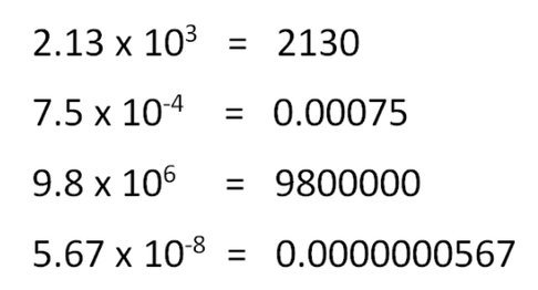
Scientific notation is used for scientists to more easily write out big numbers basically. When numbers get really big or really small it can be challenging to write it all out so people use scientific notation. Just think would you want to write out a number with 20 zeros in it or use and easier way to do that. Stuff like that is why scientific notation is used. Our calculators use a little E to expressed to the tenth power and we do not write that out by hand because it expresses to the tenth power so why not just but times ten then an exponent. Below are some examples of scientific notation.
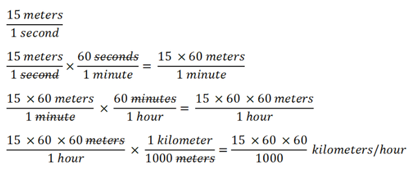
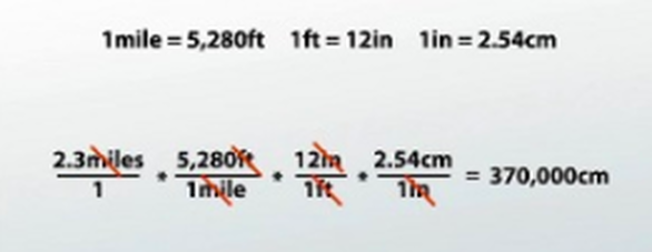
Often Scientists and all people who use units have to convert between different units. Whether it is as simple as grams to kilograms or feet to miles or as advanced as miles per hour to meters per minute. All you actually need to have a conversion chart or a computer and a calculator to do these conversions. Below are some examples that can show how to do unit conversions better than I can explain it.
A linear graph is a straight line. This means there is a constant slope or a constant rate of change. If a car is traveling the same speed over 3 hours this means after one hour the travels 60 miles then after 2 hours it would have traveled 120 miles and after 3 hours it travels 180 miles. This is different from an inverse or quadratic graph, both of those do not have a constant rate of change. For a quadratic line the rate of change is either always increasing or decreasing. So a quadratic line the car is traveling for 3 hours after one hour it travels 60 miles after 2 hours it travels 140 miles and after 3 hours it has traveled 250 miles. The rate of change with the speed is increasing and not constant. For an inverse equation the rate of change is rapidly increasing or decreasing at the start or end then the rate of change starts to decrease. These lines have limits which is a a number that it will continue to get closer and closer to but never touch. The car this time travels 5 hours after 1 hour it traveled 60 miles after 2 hours it traveled 180 miles after 3 hours it traveled 320 mile after 4 hours it traveled 360 miles and after 5 hours it has traveled 380 miles. On all graphs the y intercept means what the dependent variable is when the independent variable is zero. Sometimes there cannot be a value for the y intercept because that means sometimes it is nothing and it is impossible to measure nothing, it does not exists. Below are some visuals of the 3 types of graphic lines.
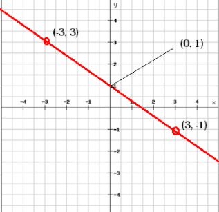
Above is a linear line with a slope of -2/3
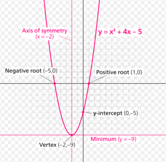
Above is an example of a quadratic line
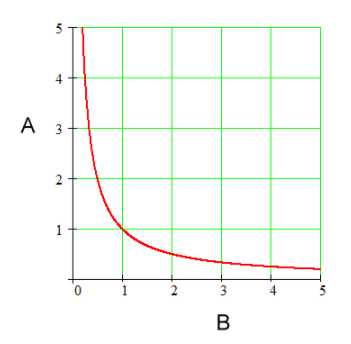
Above is an example of an inverse line
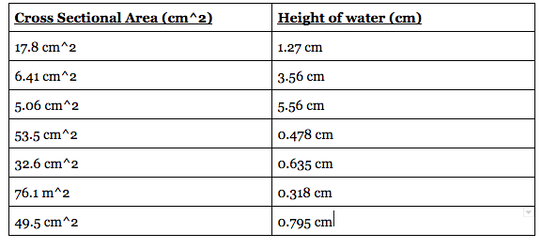
Now that we learned what the different types of graphs are lets uses some practice with matching data points to a line an interpreting them. We will use the data from the container experiment that I did earlier.
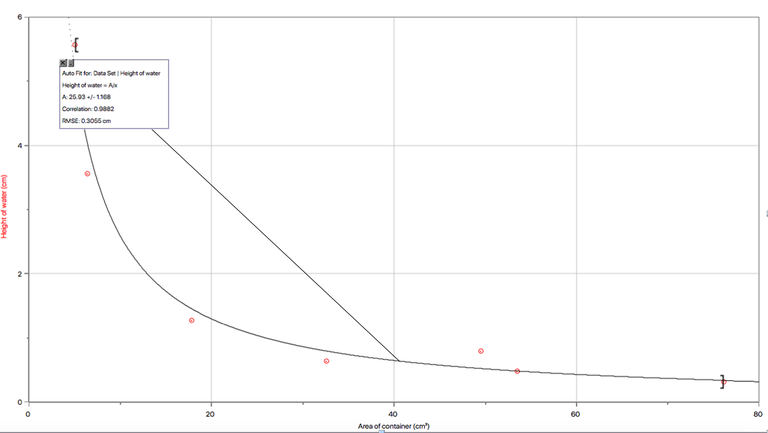
We used the set of data and plug it into a graph. We already see this is a inverse relationship. Both the height of water and the area of the container values will continue to get closer and closer to zero but will never reach it. We see the equation for the graph is the height of the water (cm) is equal to 25.93 cm^3 divided by the are of the container (cm^2). We can use this to make predictions of what other certain values of the area will read in relating to the height of the water. Each point on the graph now is an exact data point in which we took the measurements but the graph is for future predictions. There is some uncertainty in the graph because not all the data points are sitting on the graph. This means that the graph is not 100% accurate but as long at the uncertainty is low then the graph should give a good estimate of future points.
